February 08, 2010
Search Suggestions
You used to be expected to type for yourself. But today people have come to expect a reasonable amount of help at even this task. Our phones now help us form correctly-spelled words, our browsers fill in long addresses after we’ve typed only a few characters, and search engines recommend searching for “Humphrey Bogart” after we’ve typed just “boga.”
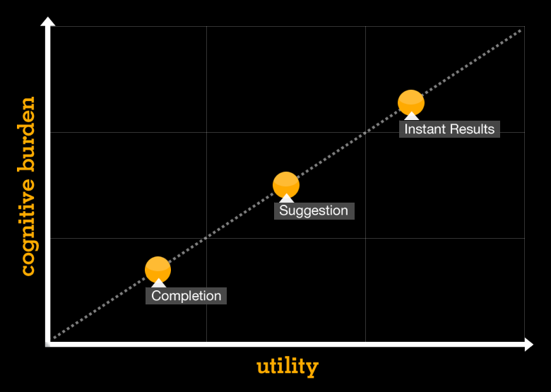
But not all as-you-type search suggests are created equal. Careful observation seems to reveal three different approaches: completion, suggestion, and instant results. These approaches range in cognitive burden on the one hand, and utility on the other. We’ll look at several examples of each and consider when they should be used.
Completion
The simplest of these three approaches is query completion. The sole role of completion is to reduce the friction involved in getting an idea out of your head and onto the computer screen. Just like a fluent translator improves the conversation between two people who speak different languages, so query completion helps a person and a computer communicate a bit more coherently.
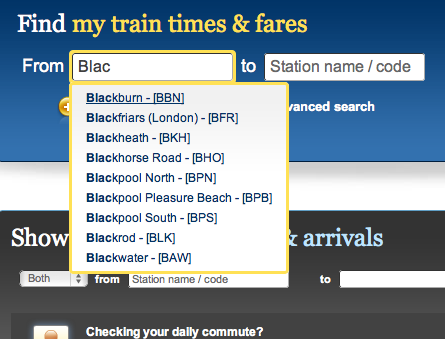
Completion makes the most sense when dealing with a narrow strand of finite data. It’s commonly employed for concepts like geography (airports, cities, countries), finance (ticker symbols, company names), and people.
Query completion has many advantages over a plain-text search. It saves the user time by cutting out unnecessary keystrokes (i.e. I could type “Birm” and accept the suggestion of “Birmingham”). It also helps prevent spelling mistakes (I can just type “Mitsub” instead of remembering how to spell “Mitsubishi”). And, unlike some of the other forms of search suggestion, query completion does not suffer from being complicated or mentally tiresome. On the contrary, it can be such a natural behaviour that we almost don’t even realise it’s occurring.
My consensus, then, is to use completion whenever and wherever possible. It will make your users more productive without the risk of confusing them.
Suggestion
Suggestion is by far the most ubiquitous auto-complete approach. The obvious examples are search engines such as Google and Yahoo, though it’s used on virtually every category of website.
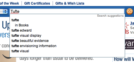
While completion helps get an idea from your head onto the screen, suggestion actually throws new ideas into the mix. It’s not too dissimilar to what happens when you tell your travel agent that you’d like to go on holiday. The agent comes back with a handful of suggestions like the Swiss Alps, Jamaican beach, or Vietnamese jungle. Similarly, if I type “guitar” into eBay’s search field, I get suggestions for “electric guitar,” “acoustic guitar,” and “guitar hero.”
Not only do suggestions save the user keystrokes, but they can actually help construct a more useful query than the user would have thought of on their own.
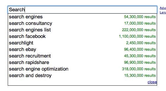
But there are a number of opportunities for maximising the power of query suggestions that are often overlooked, but which Google seem to get right. The lowest hanging fruit of these are spelling suggestions. If I type “guitaf” into Google, the first suggestion that appears in the list is the correctly-spelled word, “guitar.” Surprisingly, this elementary feature is missing from giants like eBay, Amazon.com, and Yahoo. A second technique is to display the number of results for each selected term, as Google do with a right alignment. This has a risk (which we’ll get to in a bit), but it can help the user gauge the popularity of a given suggestion. And lastly, it’s often helpful to infuse suggestions with recent searches. One approach, which Safari utilises, is to simply have two groups, one for query suggestions and another that lists the user’s recent searches. A more sophisticated approach could be to use search log data (either for one user, a group of users, or all users) to augment the scoring of the query suggestions themselves.
When deciding what features to include in search suggestions, it is important to consider the mental load that they will exert upon the user. Every addition of new information will add precious milliseconds of processing time for the user’s brain to digest that information. The trick is to strike the right balance between usefulness and cognitive burden within the context of your application.
Instant Results
The third approach differs greatly from the first two forms of search suggestions. In fact, instant results doesn’t offer query suggestions at all, but instead offers actual results to the user, often organised into a handful of categories.
Apple is perhaps the most well-known purveyor of this technique, both on their website and on OS/X’s desktop search, Spotlight. When I type the letters “mou” into the search box on Apple.com, I get five search results, the first being Magic Mouse. If I accept that suggestion, however, I am not taken to a search results pages with the query of “Magic Mouse,” but am actually taken directly to the Magic Mouse product page.
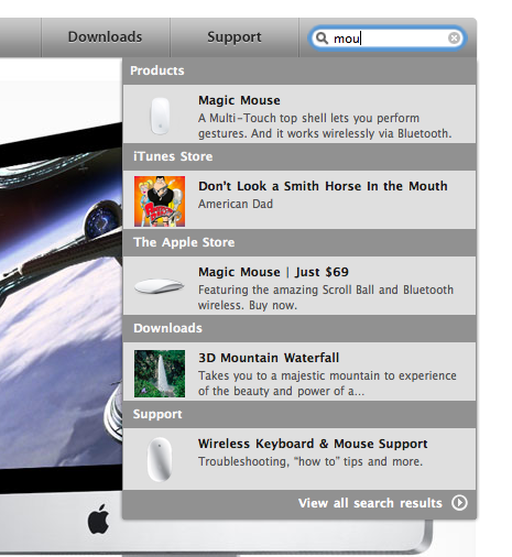
A key feature of instant results is that it can often diminish the need of having a dedicated search page. Instead, search results are provided in a contextual drop-down without leaving the page. The benefit is of course that the user is able to view results as they type, cutting out the additional time required to load a second page.
However, there are risks associated with instant results. First of all, the ability to provide query suggestions is lost since results are shown instantaneously. A second concern is that instant results usually only have space to show a handful of results, and often require quite a lot of space even at that. More specifically, instant results carries with it a much greater cognitive burden on the user than do either completion or query suggestion. It simply takes more time to parse through the multiple categories and apprehend all the metadata associated with each result.
But there is a time and place for everything. Instant results work great when there is highly structured data neatly divided into a handful of categories. Take the forthcoming Nutshell CRM application, for example. The search field only covers three entities: leads, accounts, and contacts. In this context, query suggestions would be useless. It would also be very rare for a result to be buried very far down the list, so the user would almost never need a full page of search results. In this situation, instant results helps the user find what they’re looking for quickly, and with as little friction as possible.

These three approaches differ greatly in both their usefulness and the effort required to use them. Completion is easy to understand and almost always results in a net benefit for the user. Suggestion, because it throws new ideas in the mix, is slightly more complex, but that is usually outweighed by its helpfulness. And finally, instant results work well for simple, highly structured data, but at times runs the risk of overwhelming.
Further Resources
Tyler’s Flickr collection of search suggestion examples Peter Morville’s collection of search patterns Google’s original blog post announcing the release of search suggestions Jared Spool’s article on spending quality time with your search log Smashing Magazine’s article on designing the search box
The Deck
Tyler presented a talk on search suggestions at the Enterprise Search London Meetup on February 4, 2010. The presentation is available on SlideShare.
Originally published on the Twigkit blog.
blog comments powered by Disqus