May 12, 2014
Better Wayfinding on Pinterest and Spotify
- “I want to find some new music to listen to.”
- “I need some inspiration for my bicycle renovation project.”
- “I’m in the mood to watch a thoughtful, uplifting film.”
We face these kinds of open-ended tasks everyday, but they are often difficult and frustrating to tackle. (Ever given up in despair after spending half an hour trying to find a film to watch, for instance?)
Keyword search is a great tool for answering specific questions, but it’s less useful if we’re not sure exactly what to ask in the first place.
Pinterest and Spotify have both recently made their services more effective at answering such open-ended questions. Pinterest just released what it bills as guided search, while Spotify’s latest version includes a reinvented browse function. What can we learn from these two new features?
Three Types of Needs
First, lets put these open-ended questions in context. Most information needs that a user has fall into one of three categories (see Designing the Search Experience for more background):
- Locate. I know exactly what I’m looking for, I just need help finding where it’s located. For example: I want to listen to Parachutes by Coldplay.
- Explore. I have an open-ended goal, and the journey — the information I encounter along the way — is as important as the destination itself. The three opening examples all fall into this category.
- Meander. I’m not looking for anything in particular, I just have some spare time and want to have fun. For example: I have a few minutes to kill… lets see what’s happening on Twitter.
Keyword search is ideal for locating known-items, and social networks such as Facebook are happy to help us fill those spare minutes with meandering. But exploring remains underserved.
I like to think of exploratory questions as a process of wayfinding. When navigating across a city, a person might use maps, refer to signs, and “follow their noses.” In the same way, a person may browse, search, and pick up nuggets of information along the way as they explore a digital environment.
Previously, both Pinterest and Spotify heavily relied on keyword search to help people locate the pins or artists, albums, and songs that they already knew about.
Each company’s recent improvement, however, makes it easier to find your way when you aren’t sure exactly what you’re looking for.
Pinterest’s Guided Search
Pinterest’s new guided search feature helps users find their way by suggesting relevant query refinements.
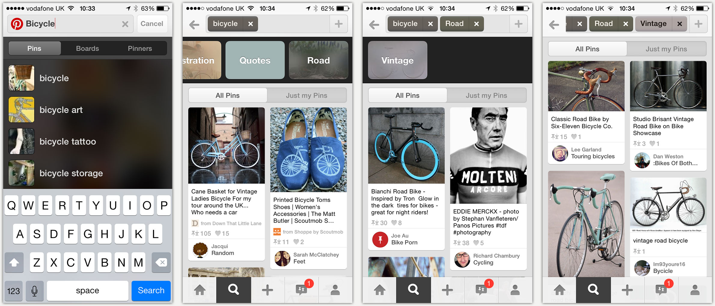
Lets say Harry is considering undertaking a bicycle restoration project and is looking for some inspiration. He could start by simply typing “bicycle” into the search box. While Harry may well get some interesting ideas from the pins that are returned, he would probably do even better with a more precise search.
That’s where the guided search feature kicks in. Having returned results for “bicycle”, Pinterest then suggests a number of related terms that Harry might want to add to his query, such as “Vintage”, “Road”, and “Accessories”. Lets say Harry selected “Road” — he would then be presented with results relevant to both “bicycle” and “road”. He would also be shown a new list of suggested refinements, such as “vintage”.

Figure 1b: See a list of suggested refinements, and choose "road".
Figure 1c: Select "vintage".
Figure 1d: Results for "vintage road bicycles".
In this way, Pinterest is attempting to optimise the process of wayfinding; they are trying to guide users along a journey to help them find what interests them most. Without the guided search feature, users would need to think of the query refinements themselves. But as we know from the principle of recognition over recall, it is much easier to recognise a relevant term than it is to think of it on your own.
Pinterest is certainly not the first to provide such functionality — showing a list of related searches is a common pattern — but Pinterest have made it a focal point of their experience, and have executed the user interface particularly well.
Browsing on Spotify
Like Pinterest, earlier versions of Spotify relied heavily on the user typing in the name of a song, album, or artist into the search box. While this works well for locating, it’s ineffective at helping people explore. Along with Spotify’s recent dark-themed redesign, however, came a new “browse” area.

Rather than expect the user to know ahead of time what song they want to listen to, Spotify’s browse area presents a listing of 25 “genres and moods”, as they call it: party, workout, chill, country & folk, jazz & blues, and so on. Selecting one of these genres, “Country & Folk”, for instance, then presents a selection of playlists for that particular genre. Playlists under country and folk, for instance, include entries such as beards & flannel, nu-modern, indie folk, and roots revival — each with dozens of tracks that have been tastefully curated.

Better Wayfinding
Both Pinterest’s guided search and Spotify’s new browse feature help people wayfind — to explore their open-ended questions. They help people hone in on the treasure buried in the midst of a vast sea of pins and songs.
For more ideas on designing for effective wayfinding, I’ve outlined six guidelines in a recent UX Matters article.
blog comments powered by Disqus