November 07, 2013
Information Wayfinding

We are drowning in information. As more and more data floods in, we find ourselves in a state of information anxiety.
“Big data” is today’s buzzword of choice. People like to talk about using clever technology to “make sense of big data.” I would suggest, however, that big data is not a technology problem. It’s a people problem.
I believe the question that we need to ask is this:
How can we make ever-growing volumes of information accessible and useful to people without overwhelming them?
In my talk yesterday at the Enterprise Search Summit in Washington D.C., I attempted to outline a new vocabulary with which we can use to answer that question. But first, it’s worth putting the problem in context by reviewing the history of information.
A Brief History of Information
For our purposes, lets consider two eras of information: the analog era, and the digital era. The analog era begins with the written word, and concludes with the printed book, while the digital era covers early web pages through to our present state of information overload.
The Tablet And The Written Word

In its earliest form, the written word was meant to be read linearly. It had no table of contents and no index.
The Scroll And The Table Of Contents

Scarcely a format conducive for rapidly jumping from place to place, scrolls were also intended to be read linearly. Despite this constraint, the first tables of contents were developed for scroll manuscripts. In the first century A.D., for instance, Pliny the Elder preceded his 37-volume Natural History with a detailed table of contents. Such tables distilled the contents of a work into a taxonomy of volumes, sections, and chapters so that a reader would not have to scroll through the entire work to find their topic of interest. This marks the beginning of non-linear information retrieval.
The Printing Press And The Index

It wasn’t until the development of the printing press, however, that the taxonomical organization of the book — the table of contents — was augmented with a secondary organizational scheme: the index. Having transformed leafless, handwritten scrolls into mass-market books with numbered pages, the printing press made it practical to create, replicate, and use an alphabetized index of topics. If the reader could not locate their topic of choice in the table of contents, they could look it up in the much more granular index and jump directly to the relevant page in the book.
The Early Internet And The Web Page (1990’s)
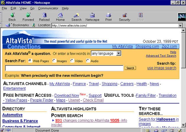
The early World Wide Web simply replicated the format of the book in digital form. The book became the website, the table of contents became the website’s navigation, the index became the search box, and most obviously of all, book pages simply became Web pages. At that time, search performed exactly the same role on a website as the index had performed in a book — it was an alternative way of locating a page of information.
The CMS And The Search Engine (2000’s)
The advent of Content Management System (and the Digital Asset Management System in the enterprise) meant that content was being “tagged” — enriched with structured metadata. At the same time, modern search engines were emerging with the ability to facet on this metadata. Together, these developments made search much more useful than before — helping people explore as well as locate. However, search remained subservient to navigation.
While search was still playing the role of a book index, faceted navigation meant that instead of there being a just single index of keywords, each facet became an index in its own right, thus compounding the usefulness of search.
However, tension increased between the table of contents and the index, between the interaction methods of navigation and search. People had to use separate interfaces for each of these two functions. And behind the scenes, they were each powered by different technologies.

Big Data And Information Wayfinding (2010’s)
While CMS and DAM systems are still used to manage content and documents, the modern company now has myriad additional sources of information with which to reckon.
The segregated architecture of navigation from search is creaking under the weight of ever increasing volumes of information. While separating the table of contents from the index is fine for a book, the metaphor has been stretched to its limits and needs replacing.
The Information Environment: A not-so-new metaphor
Fortunately, there is an obvious alternative. Consider the language we use to describe our interaction with computers: browsing the web, surfing the net, navigating a website, traversing a hierarchy, going back, scrolling up and down, returning home. Our history of using computers to interact with information is littered with such metaphors. Haphazard though they may be, they highlight a universal reality of human psychology: we perceive the world — both physical and digital — in spatial terms.
“Mankind evolved in a world of space and time. Our memories evolved to record events that transpire in space and time. Modern attempts to externalize and enlarge that memory should not, and probably need not, neglect its spatiotemporal dimensions.” — George A. Miller, 1968
We need to jettison the old “information as a book” metaphor, and embrace the even older “information as a physical environment” metaphor.
Elements Of The City Image
Before unpacking the implications of the “information as a physical environment” metaphor, its worth quickly considering physical environments in their own right.
In his 1960 book, The Image of the City, Kevin Lynch famously outlined five elements of the city image. Crucially, he considered not just the physical qualities of the environment, but sought to understand the city from a human the perspective.
“We must consider not just the city as a thing itself, but the city being perceived by its inhabitants.” — Kevin Lynch

The five elements Lynch identified are:
- Paths. The roads, footpaths, and transportation lines by which a person moves through the city.
- Edges. The walls, railway lines, and shores which form the boundaries between areas.
- Districts. Broad areas of the city that possess their own sense of identity.
- Nodes. Points of interest which a person may enter, such as a junction, building, or city square.
- Landmarks. A physical structure — such as a sign, building facade, or mountain — which serves as an external reference point.
Lynch’s ideas on how people view and move through a city are insightful precursors to how people conceptualize and navigate information spaces today. But enough about physical elements. What about information environments?
Elements of the Information Environment
First, we must define information environments in their own right:
An information environment is a place someone goes to seek information in order to satisfy an information need.
Websites, mobile applications, scientific databases, corporate intranets, and other collections of information all qualify as information environments. Lets select a few example information environments to frame the discussion that follows:
- Amazon.com. People visit this store to look for and buy products.
- New York Times. People come to this environment in search of news.
- Company intranet. People come to this area to find documents and information relevant to their job.
Following Lynch’s example, we must look beyond the brick and mortar of the environment itself to understand how people, the waypfinders who visit the territory, interact with and conceptualize that environment. To that end, I think that most information environments consist of three principle elements: districts, layers, and nodes.

Districts
Districts are the main categories into which an environment can be logically divided.

Any environment of substantial size, whether a city or a website, will inevitably be subdivided into smaller areas. London, for example, has districts such as Mayfair, Soho, and Southbank, while The New York Times (both in its print newspaper and on its website) has districts including World News, Politics, and Technology. Small environments may contain just a few flat districts, but bustling environments often feature rich taxonomies of districts within districts.
Layers
Layers are secondary categories which describe a specific facet of a given node.

Districts form the primary structure of the environment, but there are countless additional criteria that affect what a person may be looking for. Someone trying to find a place to eat in London’s Soho district, for instance, probably doesn’t want just any restaurant in the area; instead, she might be looking for a restaurant in a certain price range that serves a certain type of cuisine. In addition to a geographic preference, in other words, she also has a price criterion and a cuisine criterion.
These secondary criteria can be treated as layers. While city districts bound an area along two dimensions — length and width — layers introduce a third dimension: depth.
Some digital maps allow users to select the layers of information to be presented — such as topography, roads, landmarks, and restaurants. Similarly, the layers of an information environment enable users to mould their view of the environment so that it aligns with their criteria. Layers help them filter out the noise and tune in the signal that resonates with their own mental model.
Nodes

Within a district there are many nodes — precise points in the environment that we might otherwise refer to as a Web page, document, or record. There are two different types of nodes: informational and directional.
Informational nodes, as the name suggests, contain information about a specific concept. Viewing the details of a product on Amazon.com, reading a New York Times news article, and scanning the HR vacation policy page on your company’s intranet are all examples of interacting with informational nodes.
Directional nodes, on the other hand, do not provide content of their own, but help direct people to the relevant informational nodes that do. Somewhat analogous to a cluster of directional signs at a large intersection, or a directory of shops at a mall or airport, directional nodes often list the key informational nodes within a given district or layer. Examples of directional nodes include viewing the HR section on a company’s intranet, clicking on World News category at NYTimes.com, and browsing used English-language hardcover economics books on Amazon.com.
Information Wayfinding: The Human Element
How do people interact with the elements of an information environment? I think of the process as information wayfinding. I’ve thrown the term around once or twice already, but we haven’t yet defined it.
Wayfinding itself is the collection of cognitive processes people use to navigate physical environments. At its root it is spatial problem solving, a process closely studied by environmental physiologists.
Information way finding, then, is the collection of cognitive processes people use to navigate information environments.
People often engage in three different types of wayfinding, what I label as: locate, explore, and meander.
Locate
- “Who was the director of the film ‘The Third Man’?”
- “What is the population of London?”
- “When are expense filings due?”
- “Where is Jimmy’s Pizza”
These are all examples of “locate” information needs. In each case, the user has articulated precisely what they’re looking for. They just need help locating it. We sometimes call these “lookup” queries, and there is typically one right answer to the question.
Explore
- “What kind of car should I buy?”
- “Where should I go on holiday?”
- “What film should I watch this evening?”
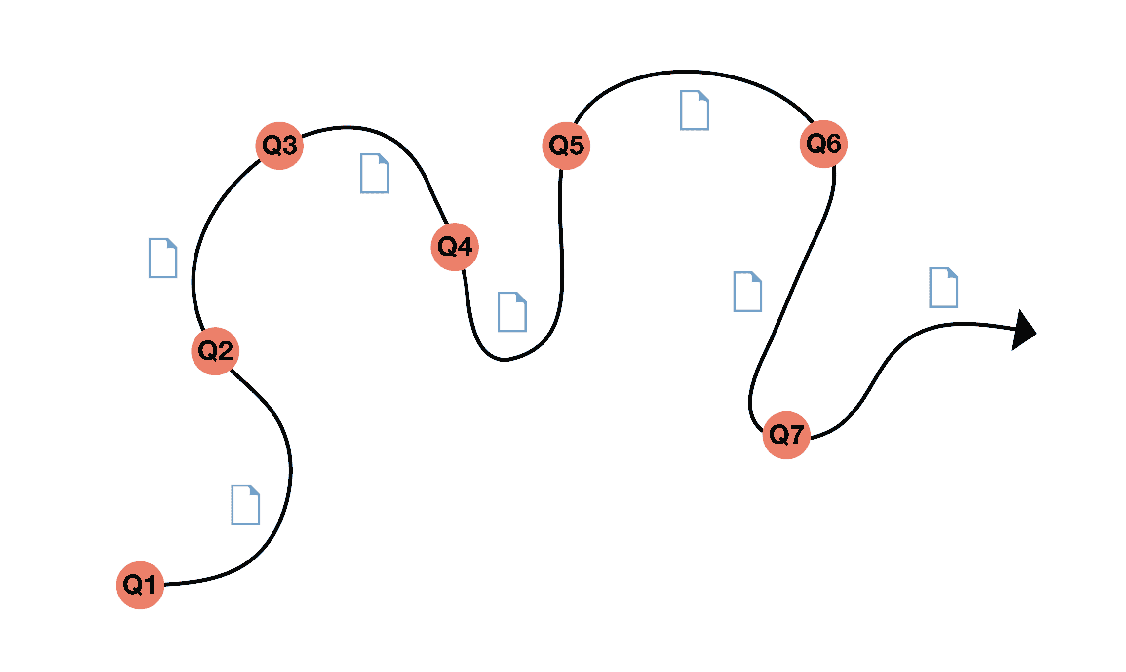
Exploring is much more open-ended than locating. When people explore, the journey is as important as the destination. As people encounter new information, their information need evolves, resulting in an iterative, ongoing process. In other words, users engage in information wayfinding.
Marcia Bates has described this process as “berrypicking” — people move from one source to another picking up nuggets of information along the way. Peter Pirolli and Stuart Card describe the process as “information foraging,” where people follow “information scent” as they go. Both of these models depict information seeking in spatial terms, and reinforce the concept of information wayfinding as a result.
Meander
While locating and exploring are both prompted by an information need, there is a third category which is not: meandering. People sometimes aren’t looking for anything in particular, but might be prompted by other motives such as having fun or killing time. Checking email or social networks while waiting for the bus to arrive is just one example of meandering behavior.
Principles for a New Architecture
So far I’ve proposed that a collection of information is best thought about in terms of an information environment, that the information environment consists of three distinct elements, and that wayfinding is a useful way for considering how people interact with these environments.
Finally, I would like to propose six principles that should guide how we go about constructing information environments: structured districts, flexible layers, positional cues, survey knowledge, clear paths, and coherent interaction.
To more effectively demonstrate these principles, one day last week I built an application using Twigkit and a collection of excellent film data curated by Nasser Ahmed.
Structured Districts
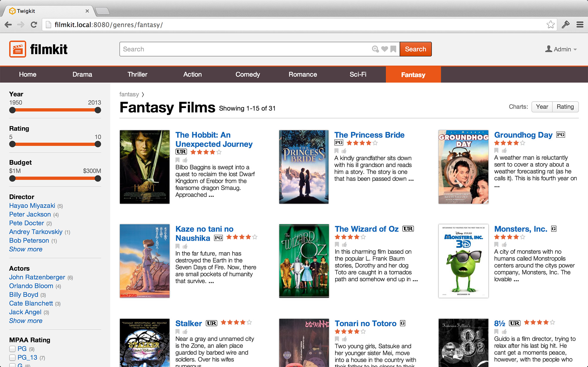
We’ve said that districts are the main categories into which an environment can be divided. Logical, clear districts are important to help users understand the information environment at its most basic level. Districts should correspond with the user’s own mental model. When people think about films, for instance, they think in terms in genres: a film is an action film or a drama film, a comedy or a thriller. Virtually every domain has some dominate organisation scheme that should form the districts of the information environment.
Districts should be clearly presented to users, perhaps in a form resembling traditional web navigation. Correspondingly, the URL scheme should also be based on districts.
Flexible Layers
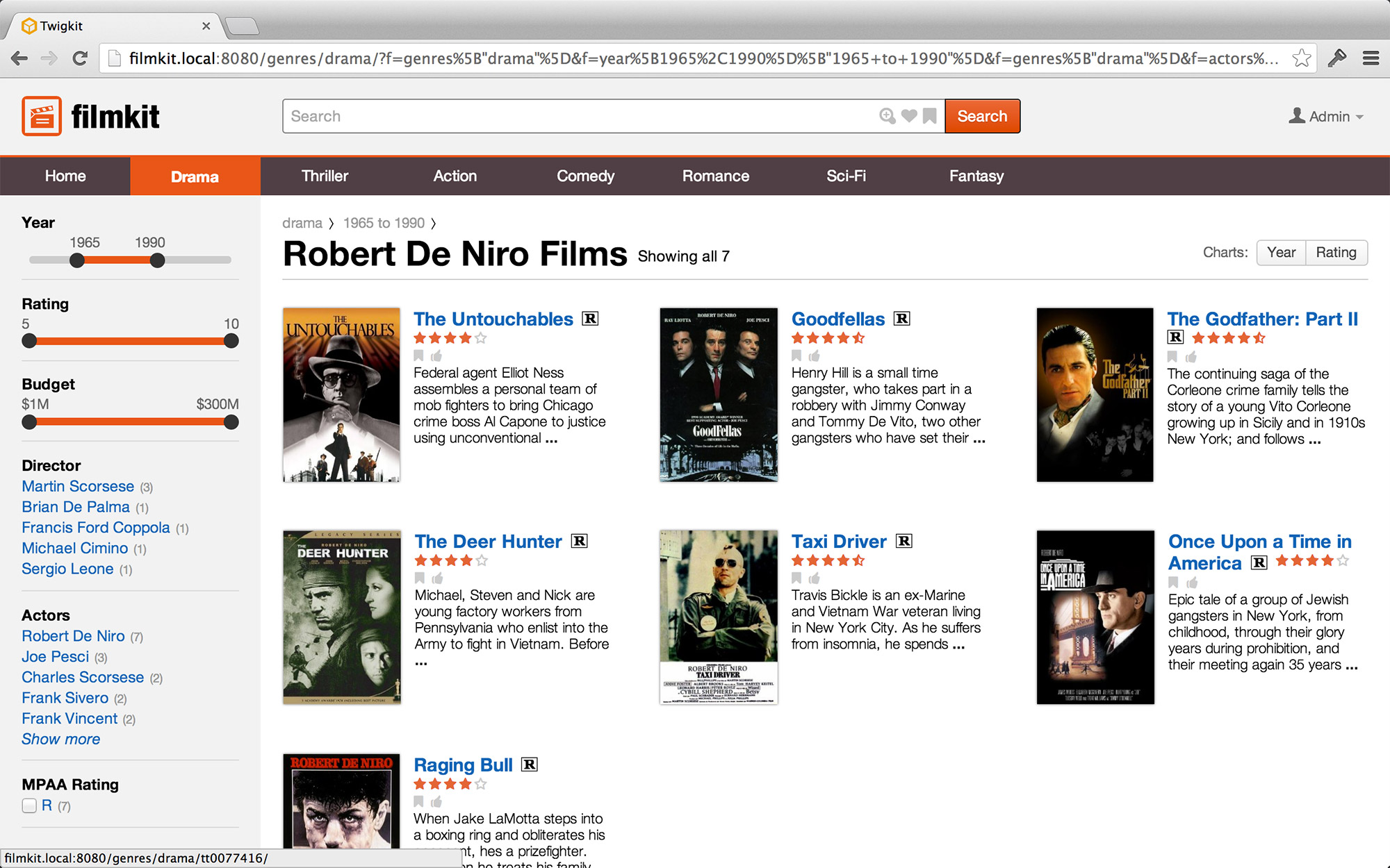
In addition to districts — which serve as the primary organisation scheme — users should also be able to filter by secondary criteria, which we’ve said resemble layers of the information environment. The flexibility of layers is a vital companion to the rigid hierarchy of districts, and the two should operate in tandem.
Positional Cues
Like a “you are here” marker on a map, positional cues help users orientate themselves within the information environment. Most frequently, positional cues take the form of breadcrumbs — they indicate the district in which the user is browsing, what layers they have applied, and any search terms they have entered. These positional cues give users a sense of security, and avert any feelings of lostness.
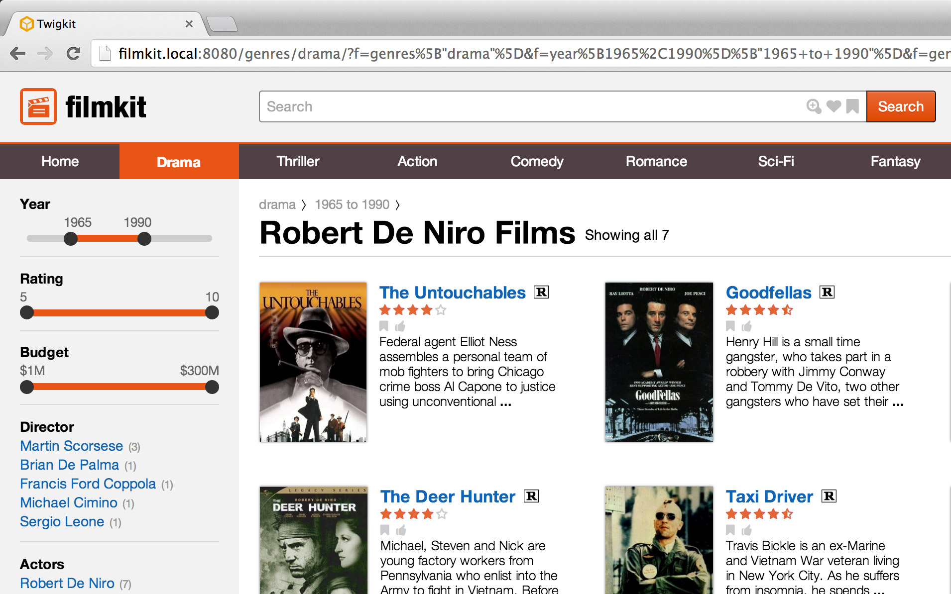
Survey Knowledge
Helping users gain survey knowledge is a second form of enhancing orientation. But while positional cues more often depict where the user has been, survey knowledge helps them ascertain where they should go next. Like studying a map or looking at the landscape from the top of a mountain, survey knowledge gives users an overview of the information environment. Data visualisation — from subtle indicators to full fledged charts and graphs — are an excellent tool for enhancing survey knowledge.
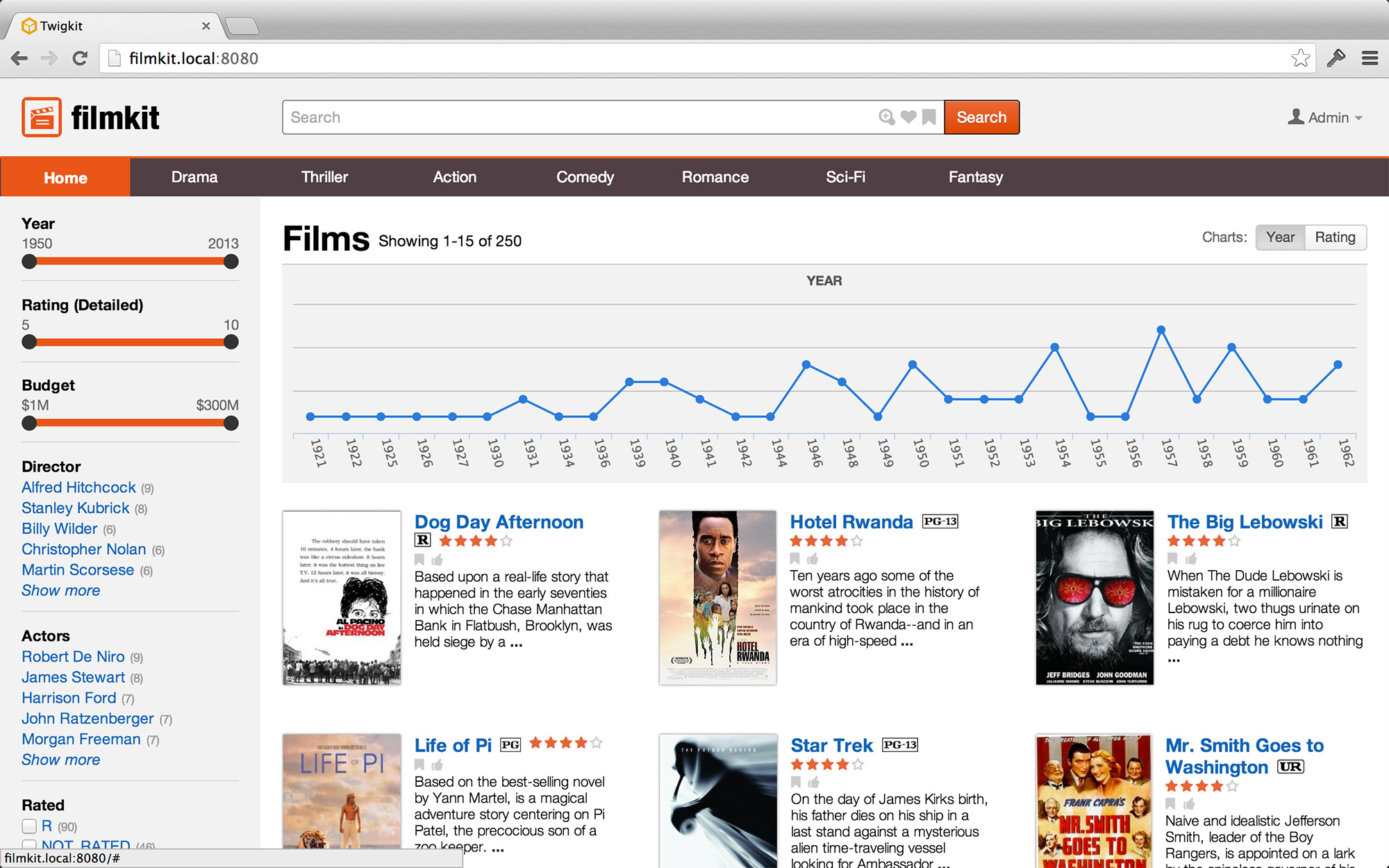
Clear Paths
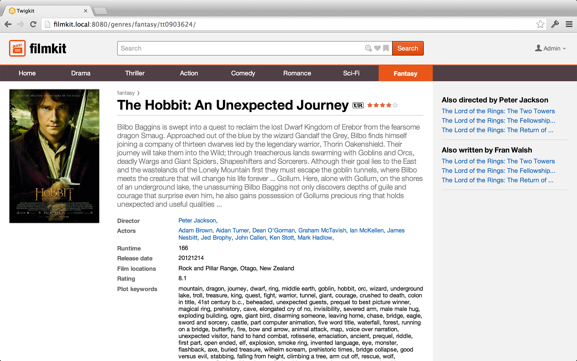
In a physical environment, having a clear line of sight to the destination greatly simplifies the act of getting there. It would be orders of magnitude more difficult, I’m sure you’d agree, to navigate to a destination blindfolded. So in information environments, having clear paths ensures that users always have a path onward.
A good example of this principle is having links to related content. When viewing an information node (what we often call a “detail page”) for a film, for instance, having clear paths to similar films, to films by the same director, starring the same actors, and so forth, gives users a sufficient number of paths forward.
Coherent Interaction
Most importantly of all, I believe that interacting with districts, layers, and keyword search should be a single, seamless experience. Layers should not only be available in “search mode,” and keyword search should not be divorced from districts. Instead, users should be able to navigate to districts, apply layers, and perform searches iteratively and conjunctively.
Conclusion
Let’s return to the question we asked at the beginning:
How can we make ever-growing volumes of information accessible and useful to people without overwhelming them?
I believe we must:
- Consider information as a spatial environment
- Understand how users find their way through information environments, and support them along that journey.
- Unify navigation and search into a single, coherent experience.
If we pursue these three things, then search will no longer be just a box in the top right corner, but will become the de facto way people interact with large information environments.
In fact, the world’s most successful online properties — Google, Facebook, Amazon, eBay — have already embraced these three tenets. The question is: will you?
Slides
Here is the full slidedeck from my talk at the Enterprise Search Summit.