February 21, 2012
Cross-Channel Blueprints: A tool for modern IA
The practice of information architecture is undergoing a tectonic shift away from creating individual websites and towards designing cross-channel experiences that span both the digital—from desktop to mobile—and the physical—from print to storefront. While the information architect’s skillset is well-suited for this new challenge, our existing tools are not.
Service blueprints aren’t exactly what we need
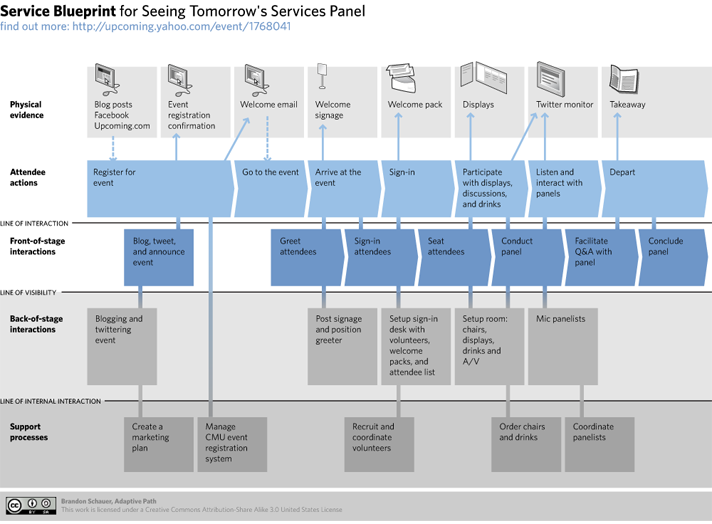
Imported from the field of service design, G. Lynn Shostack’s service blueprint is often suggested as a tool for cross-channel planning. Yet it’s not a perfect fit:
-
Too process-oriented. Service blueprints present customer actions sequentially. While desirable for planning specific flows (such as a checkout process), it’s obstructive when trying to outline a comprehensive strategy.
-
Minimal attention to channels. Service blueprints document the “physical evidence” associated with each action, but fail to account for how a single action might be performed on multiple channels.
-
Meant for a different purpose. With their lines of interaction, visibility, and internal visibility, service blueprints simply weren’t intended to be used for planning cross-channel information architecture

What do we need, then?
Before brainstorming solutions, we should clarify the problem. Andrea Resmini and Lucas Rosati have discussed five principles for designing successful cross-channel experiences; Peter Morville advocates six; to me, these three seem the most fundamental:
-
Consistent. Each channel should enable users to perform a given task in a like manner. For instance, a bank customer experienced in paying bills on the web should find the corresponding smartphone bill-paying facility familiar, even on first use.
-
Optimized. Each channel should play to its strengths. Desktop applications are optimized for large screens; mobile apps for small ones. Optimization is in tension with consistency.
-
Continuous. Each channel must be aware of all the others. Add a bicycle helmet to your shopping cart on the Web, and it should appear in the cart on your phone.
A starting point

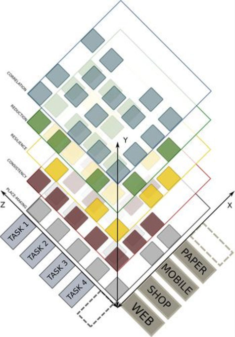
What would a tool that aimed to facilitate consistent, optimized, continuous cross-channel planning look like? In Pervasive Information Architecture, Resmini and Rosati presented their CHU cube which places tasks and channels each on their own axes.
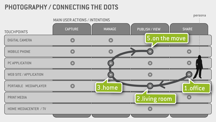
Ammendment: After publishing this post, Gianluca Brugnoli of Frog Design pointed out its resemblence to the Touchpoints Matrix he himself developed in 2009. I hadn’t come across this tool before, but the similarity is striking.

Building on the foundation
Juxtaposing tasks and channels is a useful starting point, though the CHUbe’s multidimensional layers make it a bit unwieldy. For our diagram, let’s do the following:
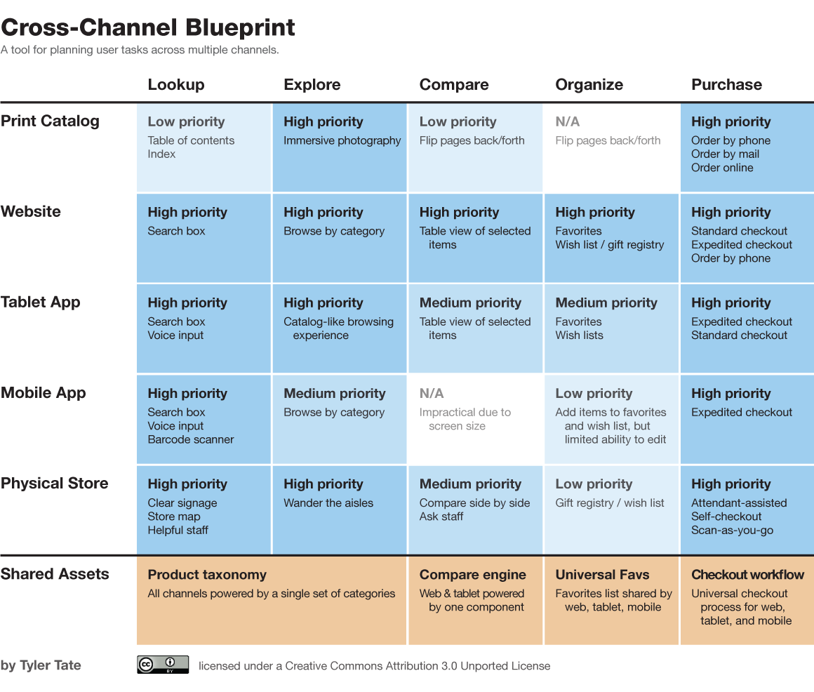
- Identify user tasks—these become the X-axis.
- List channels—these become the Y-axis.
- Prioritize and describe each per-channel task—these are the table cells
- Identify shared components—these are listed in a bottom row

I call this a cross-channel blueprint. The exercise can be performed by a lone designer or collaboratively with sticky notes or in front of a whiteboard. It brings about:
- A global view of important user tasks
- The possible channels through which users might attempt those tasks
- A set of task priorities for each channel
- A set of channel priorities for each task
- An overview of which components need to be shared across channels
What do you think?
This is but a first attempt at a developing a tool suitable for the new era of cross-channel information architecture. As such, it needs practice, iteration, and experimentation. If you’ve been working in this space, please chime in with how the cross-channel blueprint jives with your own experience.
See my article The Rise of Cross-Channel UX Design on UX Matters for related reading. You can also follow me on Twitter.
blog comments powered by Disqus